Welcome

Oh, I see! How inventive! You've actually stacked the boxes I am supposed to live in!

Welcome to the architectural blog discussing New Classicism, New Urbanism, modern and historical architects, their work and the continuum of Humanism in architecture. You may submit articles for inclusion in this website through email.

Friday, July 9, 2010

Modern Nazca Lines??

What are we saying about ourselves?

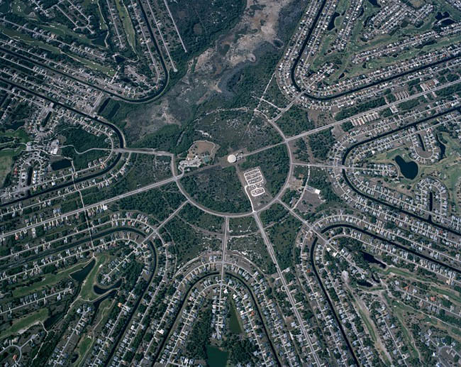
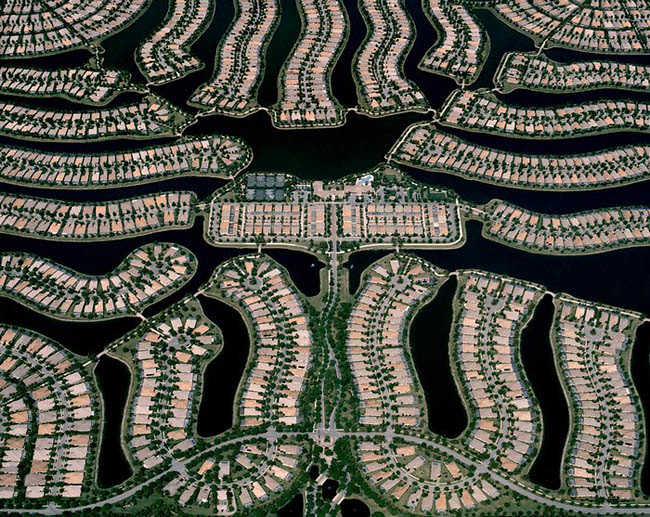
Christoph Gielen's aerial studies of suburban land-use patterns can be seen in Culturehall, the online art magazine curated by David Andrew Frey around the theme "Future History."

[Image: "Skye Isle II, Florida" (2009) by Christoph Gielen].
[image: Zigzag pattern - Nazca, Peru]

Glyphic, abstract, and typological, Gielen's chosen land forms span the multi directional universe of ribbons in the highway structures of Southern California to kaleidoscopic rosaries of Arizona houses.

In his own words, Gielen "specializes in conducting photographic aerial studies of infrastructure in its relation to land use, exploring the intersection of art and environmental politics."

[Image: "Untitled Arizona III" (2010) by Christoph Gielen].
[Image: Spider - Nazca, Peru]

The results are often stunning, as monumental earth-shields of anthropological sprawl reveal their spatial logic from above. Seemingly drab and ecologically disastrous—even intellectually stultifying—suburbs become complex geographic experiments that perhaps didn't quite go as planned.

Some of the photos—such as "Sterling Ridge VII, Florida" (2009), below—look genuinely alien, more like conceptual studies for exoplanetary settlements as imagined in the 1950s by NASA.

[Image: "Sterling Ridge VII, Florida" (2009) by Christoph Gielen].
[image: Spiral - Nazca, Peru]

How strange, though, and deeply ironic would it be for a photographic project ostensibly intended to show us how off-kilter our built environment has become—Gielen writes that "he hopes to trigger a reevaluation of our built environment, to ask: What kind of development can be considered sustainable?"—to reveal that the suburbs are, in a sense, intensely original settlement patterns tiled over the landscape in ways our species could never have anticipated? We are living amidst geometry, post-terrestrial screens between ourselves and the planet we walk upon.

For more on Nasca and the Geoglyphs visit National Geographic Online.

Thursday, July 8, 2010

Why Grand Central Works

 
by Urban Omnibus
August 5th, 2009


Vishaan Chakrabarti offered Omnibus readers a searing critique of stimulus spending: calling out the “shovel-ready” prescription as the kind of medication that will enable and encourage our gluttonous land use and development habits at the expense of intelligent investment in infrastructure. Chakrabarti doesn’t merely opine on the ways and means of reimagining the American landscape, however. In his current role as an Executive Vice President of Related Companies, he is in charge of design and planning efforts for the Hudson Rail Yards and Moynihan Station: two sites that, in order to be done right, require a careful calibration of public-private partnerships and a farsighted appreciation of the nexus between transportation infrastructure, commercial capacity and urban density.

Does that sound impossible? Politically unpalatable and financially unsound? Like it will take too long and is just too hard?

Well, we have an example of exactly that kind of accretive process in one of the city’s most beloved places, Grand Central Terminal. Why does it work so well? Listen to Vishaan tell it like it is. First, he reflects on some design details of the spectacular Main Concourse. Next, he wanders down Park Avenue and shares some of the history of how private sector competition led to a major public amenity and transformed the entire metropolitan region. Then he explores the terminal’s tentacular North-end Access and reflects further on how the terminal has transformed urban and regional economies. Finally, as he delves into the food court, he ponders lessons to be learned from Grand Central that could be applied to Moynihan Station.


Main Concourse

Lesson #1: Design matters. Beyond the obvious grandeur of its public spaces, Grand Central relies on a sophisticated layering of uses that has influenced the design of airports and train stations around the world.
Video running time: 3:22


Park Ave Construction
Park Avenue and Midtown East 

“It’s more than just the building. It’s about how hundreds of thousands of people move around a region.”

Lesson #2:
The building is only part of a larger exercise in citymaking. Grand Central catalyzed the development of some of the most valuable real estate in the world.

Running time: 4:27. Right-click here to download mp3.


47th-st
North-end Access

All great train stations… have tentacles that reach out into the city. There’s not just a front door.

Lesson #3:
Plan for phases. Grand Central wasn’t built in a day, and part of what makes it work can be found in the less than glamorous network of pedestrian access passageways.


Running time: 2:41. Right-click here to download mp3.

Grand Central Market .
Lessons for Moynihan Station 

Train stations still have an openness about them. … as hubs [they] speak to the nature of the city that’s around them.


Lesson #4:
Think big.
If we could make a commuter terminal this nice – and one that’s had such wide-ranging urban and metropolitan ramifications – imagine what we could do with a major inter-city regional rail hub?
Running time: 4:36. Right-click here to download mp3.


Listen to Bob Yaro reflect on the destruction of the original Penn Station and imagine a new future for Midtown West. Perhaps realizing that future will require looking carefully into the city’s past. -C.S

For a terrific documentary on the construction of Grand Central Terminal:
American Experience - PBS

Wednesday, July 7, 2010

Wednesday Book Review/ Promotion


Roma Interrotta
Aaron Betsky
Retail Price: $75.00
Amazon: $47.25

In 1978, twelve internationally renown architects gathered around the project Roma Interrotta: based on the map of Rome drawn in 1784 by Gian Battista Nolli, the last architectural planning for the Eternal City, the architects reinterpreted the city with a critical view towards what had been built and destroyed throughout the centuries. The projects were exhibited in Rome in 1978 and then travelled around the world. In 2008, the project was revived and inspired the theme of the Bienniale Architecture in Venice. This book collects the texts and images of the original projects/exhibition, plus the texts written for the Biennale 2008 by Aaron Betsky (Director of the Biennale Architecture), Graziella Lonardi (Director and Founder of Incontri Internazionali d'Arte) and Architect Piero Sartogo, who organised the project in 1978. The collection of drawings will soon be donated to MAXXI, the Museum for Contemporary Art and Architecture in Rome. It includes projects by Piero Sartogo, Costantino Dardi, Antoine Grumbach, James Stirling, Paolo Portoghesi, Romaldo Giurgola, Robert Venturi, Colin Rowe, Michael Graves, Len Kriero, Aldo Ross and Robert Krier.

Milano: Johan & Levi, 2009. 24cm., pbk., 228pp., 17 color, 191 b&w illus. Italian-English text. Exhibition catalogue.

...from the "Screw The City" file

AE019f.jpg
[Parkway Gate by Ian Simpson Architects, 2008 | image source]
 

"In Manchester England Parkway Gate by Ian Simpson Architects. Three towers for student housing exhibit similar forms and facade patterns, but each uses different materials in the solid areas to create a unique identity for each and for variety on the skyline. Not surprisingly the Cor-ten-clad tower exudes a particularly strong presence, especially when it is reflected in the glass of the other towers." 

from A Daily Dose of Architecture, Sunday, October 11, 2009.

Come on people!! These rusty buildings may look "cool", but they meet the city at street level with a THUD. There is absolutely no relationship to the living city, except from a high speed vehicle on the highway. Buildings like this are destroying our cities. Along with the opportunity to create such buildings comes a responsibility to respect the fabric in which they are located. Remember, these were created for use by human beings... They don't have any kind of human scale to relate to. However the ego scale is HUGE!

Monday, July 5, 2010

A Redesigned Boston City Hall

The Boston Globe recently featured ideas from readers for a few ditched projects around Boston, including the idea abandoned by Mayor Menino of demolishing and rebuilding City Hall.


Cambridge resident Aaron Helfand rendered a new Boston City Hall. "I think Boston does need a new city hall, and I think it should be built on the site of the current City Hall Plaza, in the heart of the city," he said in an e-mail to Boston.com. Aaron recently graduated from the architecture school at Notre Dame, one of only three or four in the country with a classical curriculum.


This illustration depicts the west and south elevations of Helfand's proposal.
Helfand, who completed University of Notre Dame's graduate architecture program in May, used these renderings for his senior thesis. This interior detail shows a reception room.


"With my project, I have attempted to figure out why the current City Hall and its plaza are as unpopular as they are and to offer an alternate vision, one which will create a lively public plaza, defined by inventive architecture that builds on Boston's rich architectural traditions," he said.

"Most importantly, I sought to design buildings that would last, since this is one of the most important requirements of sustainability in architecture," Helfand said in his e-mail. This image shows more details from Helfand's rendering.

Saturday, July 3, 2010

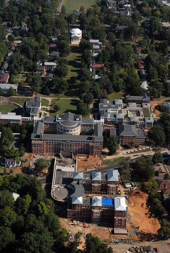
The South Lawn at the University of Virginia

Architectural Criticism from Traditional Architecture Compendium
A Compilation of Articles of and About Classical and Traditional Architecture
Posted by Dino Marcantonio
May 26, 2010

A student recently reminded me of the architectural hubbub of a few years ago at our alma mater, the University of Virginia. In September 2005, to kick off the semester, a large majority of the faculty members of the school of architecture signed "An Open Letter to the Board of Visitors, the University Administration, and the University Community" which criticized the university's periodic tendency to commission traditional architecture for buildings on grounds. It was penned in response to the university's firing of the staunchly modernist firm Polshek Partnership and the hiring of the slightly less staunchly modernist firm Moore Ruble Yudell to design the South Lawn Project.

There was a fierce reaction from the international community of traditional architects, culminating in a full page ad in the school paper, The Cavalier Daily, supporting the university's efforts to extend the principles embodied in The Lawn, the university's original buildings.


http://farm4.static.flickr.com/3438/4640125433_575311258e.jpg
The University of Virginia Lawn, designed by Thomas Jefferson.
 
Architects, historians, alumni, students, and concerned citizens lobbed more letters back and forth over the net, attracting national attention. But the most thoughtful attempt to spur the university in the direction pictured below was provided by Professor Edward Ford, one of the letter's signatories, in his talk Some Thoughts on Architecture at Virginia.

http://farm5.static.flickr.com/4052/4640794546_ebf05b908f.jpg
The University of Virginia's Hereford College,
by architects Tod Williams and Billie Tsien
.

To his credit, Ford was reserved in his praise for the hope-sapping Hereford College, surprising considering the school had recently awarded Williams and Tsien the prestigious Thomas Jefferson Medal. Nevertheless, his talk is a good reprise of the standard fallacies which dominated the discussion. They are the same prejudices which paralyze architecture schools and the profession today. It is worth reading if only because it is not so couched in jargon as your average manifesto.

I summarize his points and offer rebuttals below.

1. The Traditionalist's argument that buildings should respect their context is a fallacy. In Venice, for example, the Renaissance interventions in the Gothic context were not contextual. Therefore, buildings don't have to be contextual to be good.
2. The argument for Classicism is based on the fallacy of Associationism, i.e., the meanings we associate with certain forms are constantly changing, therefore they provide an unsound foundation on which to form judgments. There are "deeper structures" to which we must appeal if we are to judge architecture properly. We see that deeper structure when we take away the "cow skulls" (i.e., the extraneous ornament) of Classicism.
http://farm5.static.flickr.com/4035/4643490702_799475a162.jpg
Ed Ford, Pages from Venetian Sketchbook.
Superfluous detail on the left, essence on the right.

3. Modern Classicism (presumably as opposed to traditional Classicism) is a fraudulent appliqué concealing a building's true construction.
4. Diversity vs. Euro-centrism: we cannot achieve the intellectual (and therefore stylistic) unities of the past and we are richer for it. Therefore we are bound to look beyond style.

I answer Ford's points as follows:

1. To argue that a Modernist building is to a traditional context what a Renaissance building is to a Gothic context is really to misunderstand Modernism, the Gothic, and the Renaissance. The Renaissance developed naturally out of the Middle Ages. In no serious way can it be argued that the Renaissance represents an approach at odds with the Gothic. In both periods the very same tradition is being tended to, but in the Renaissance period improved scholarship and economic power are brought to bear, as well as a change in taste and emphasis. Modernism, in stark contrast, seeks to end the Greco-Roman tradition, and it pursues the pipedream of an abstract architecture whose forms have no substantive meaning. It is impossible to build an abstraction.
2. Classicists do not argue for a superficial architecture, the smearing of molding sauce all over mediocre buildings without integrity. We hold, as suggested in my point one above, that forms have substantive meaning. Ford's drawing "Pages from Venetian Sketchbook" is perfect evidence for our case that the Modernists oversimplify classicism. I can't imagine many would believe Ford has revealed the reality behind the style with these sketches.
3. If Ford really believed he had revealed the reality behind the style, Ford would have to denounce the whole history of architecture. Greek moldings are not intrinsic to ancient stone construction--would the Parthenon be better without the intricacies of the Doric entablature to disguise the real load bearing going on underneath? Are the triglyphs "inauthentic"? Roman architecture is all revetment. When the Romans invented the arch (the high technology of the day) they didn't reveal the bricks that bore the real loads, they covered them up with archivolts.
4. Ford's point here seems to contradict his point regarding context. Was Venice, a pre-modern city, uniform or not? The classicists are not arguing for perfect uniformity in any case. We are arguing for intelligibility. Renaissance buildings in the Venetian context were and are eminently intelligible, just as modern Classicism in the context the University of Virginia makes perfect sense.
Ford's principles lead to Hereford College. And had Polshek not been fired and continued with the now almost complete South Lawn Project, we can be certain it would have turned out in a similar vein. Moore Ruble Yudell, however, are a more compromising firm, shall we say. The results are now coming into full view as the project nears completion.
http://farm5.static.flickr.com/4027/4642753378_8279153312.jpg
A view of the Commons Building,
a pale imitation--mockery, really--of Jefferson's Rotunda.

Cue the trombone: WAH-wah! Alas, had the university hired a competent, staunchly traditional firm, the result would have been so much more edifying. The site plan is not awful. There is a fairly clear sequence with good spatial definition. The open circus at the end of the axis is supposed to frame the originally intended view of the mountains, blocked a century ago by McKim Mead and White's Old Cabell Hall. Strikes me as a rather weak frame, however. Jefferson positioned pavilions at the end of the Lawn to punctuate the composition, while here there is no such gesture.

http://farm5.static.flickr.com/4047/4643521394_6d4eac3966.jpg
The South Lawn is in the foreground, Jefferson's Lawn
in the background. In between the two are
New Cabell Hall, and Old Cabell Hall behind.

The basic diagram, a miniature of the Lawn set at right angles to the original, is getting to be a rather trite response at this point, having already been tried at the Darden School and Hereford College (such as it is).
The details of the building are an utter disappointment. We've already seen the boring and out-of-place glass curtain wall. The masonry bits which attempt to abstract traditional classical elements betray a decided lack of interest if not literacy on the part of the architect. What else can explain these columns and entablature?
http://farm5.static.flickr.com/4004/4643673960_bd5db76ea6_o.jpg

Certainly not budget, as in ages past we have been able to do a lot more and with fewer resources. Omitting detail is sometimes a practical necessity; however, there are ways to do it while retaining elegance in proportion. Here is my favorite example, from Palladio's Villa Pojana.

http://farm5.static.flickr.com/4064/4643692394_46ba2a3c6b_o.jpg
Palladio, Villa Pojana

So powerful, yet there is so little there! And it is not about capturing the essence of the orders. The essence is not captured by removing architectural detail any more than a symphony's essence would be captured if we removed half the notes. Remove half the notes and you destroy the symphony! No, it is about calibrating expression to suit the occasion. Here the message had to be toned down, simplified, and it was done with a sure hand.
What is Palladio's secret? How does he know which lines to remove and which to keep? I can assure you, it is not through the Ed Ford method. The answer is: years of careful study of the canon, from the grandest gestures, to the most minute detail. There are no shortcuts.
Thursday, July 1, 2010

Building designed by world leading classicist architect is new landmark for Beirut

architecturelab.net


The building provides a striking entrance to the Place de L’etoile
————————————————
“1458 Marfaa is a mixed use building on an historic site. Completed in October 2009 the building responds to the client’s request for a building of ‘timeless’ quality for a prominent corner site that marks an important medieval gateway into old Beirut.

The Bab Idriss gate of the city was said to have once sat on this site and marked the line of the rising sun on the day of the city’s foundation. The building design draws on this historic memory relating physically and symbolically to Beirut’s past. The building also acts as a formal entrance into the Place de L’etoile, created under the French mandate.

British architect Robert Adam cooperated with the Beirut architect and friend Fadlallah Dagher after his firm Dagher Hanna & Partners Architects won a competition to develop the site.

 This building provides 5,840 m2 of retail and office space and eleven luxury apartments, plus additional levels below ground for car parking.

Decoration reinterprets traditional Ottoman and Islamic forms and uses different levels of embellishment across each façade, graded in detail from the simplified street elevations to the more elaborate classical detail on the corner as the most important element of this building. A modulation of three bays with recessed balconies and set backs creates a characteristic streetscape. A proportion of 1 to 1.8 is used for this building, which is consistent with the proportions of Ottoman period town house bays.

The rooftop beacon or lantern emphasises the corner along the axis of the Roman gateway and provides a focus between the junction of the old centre and the surrounding modern city. It is a contemporary lit structure that develops a Middle Eastern classicism with modern materials.”
————————————————


Simplified street elevations


Lantern develops Middle Eastern classicism


The elevations move smoothly from minimalist approach to full classical expression 


Decoration reinterprets traditional Ottoman and Islamic forms
————————————————
About the Architects

Robert Adam Architects

The Practice was founded in 1955 and became Robert Adam Architects in 1992. It has an international reputation in classical and traditional architecture and has become a world leader in progressive classical design, combining tradition with the latest technology.

As well as significant projects in the UK and the USA the practice works across Europe, the Middle East and Japan.

Its portfolio of award-winning projects includes exclusive town and country houses, public and commercial buildings, pioneering work in master planning, urban design and the conversion, restoration and extension of important historic buildings.

The work of Robert Adam Architects has been widely published, exhibited and broadcast. As widely acclaimed experts in classical design and progressive technology, its directors are consulted by government agencies and ministries on policy and design, and regularly invited to write, lecture and teach.
In addition, all five directors are trustees of many national interest groups and founders of international architectural and urban design organisations.”

UK Architect: Robert Adam at Robert Adam Architects
Client’s representative/Local Architect: Dagher Hanna & Partners Architects

Total Blog Directory Architecture Blog Directory Blog Directory Architecture Blogs An Architectural Humanism - Blogged