Welcome

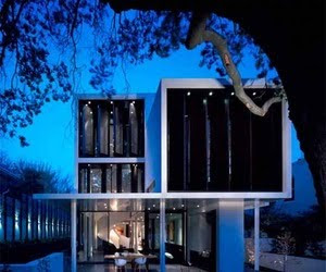
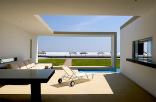
Oh, I see! How inventive! You've actually stacked the boxes I am supposed to live in!

Welcome to the architectural blog discussing New Classicism, New Urbanism, modern and historical architects, their work and the continuum of Humanism in architecture. You may submit articles for inclusion in this website through email.

Thursday, July 29, 2010

Lessons From the ‘Katrina Cottages’

 Edward R. Miller
AFFORDABLE HOUSING Habitat for Humanity of Suffolk County plans to start work in March on the first “Katrina cottage” a rendering above, in Islip.

 
IN THE REGION | Long Island

LAST June, Nell Bard, a former social worker, was flipping through a Lowe’s catalog, comparing its plans for diminutive “Katrina cottages” with her own 780-square-foot converted summer cottage in the hamlet of Brookhaven.

For some flood victims in the New Orleans area, the cottages replaced post-hurricane trailers.
When Ms. Bard showed the renderings to her boyfriend, Christopher D. Bodkin, the chairman of Islip’s Community Development Agency and until recently a town councilman, she wondered why the cottages couldn’t be the model for “highly affordable, flood-resistant housing for those of us who live here.”
As opposed to public-assistance housing on the Island, which often has a larger footprint, “a tiny house is so much cheaper to live in,” she said.

Mr. Bodkin agreed.

“They are really charming,” he said of the Katrina models, explaining that he had reared two sons, now 27 and 29, in a 625-square-foot circa 1784 cottage with two bedrooms and a little attic in Sayville — and that the elder one still lived there.

The size was always perfectly adequate, Mr. Bodkin said.

At the next board meeting of the Community Development Agency, he passed around the catalog. When he asked why the town didn’t build similar homes, he “expected 10 hands to go up,” so that colleagues could air their objections. Instead, Gene Murphy, the town’s commissioner of planning and development, enthusiastically endorsed the idea.

“Besides its affordability,” Mr. Murphy said recently, “it’s a smaller house and it fits into the community. It is meant as good starter housing to get people out of basements. For what they pay for rent, they can build equity in a house.” Paul Fink, the executive director of the Community Development Agency, said he hoped that eventually 10 Katrina cottages a year could be built to complement the 30 to 40 larger affordable homes that the town erects.

The basic Craftsman-style cottage is 918 square feet, with two bedrooms and one bath. At 26 feet wide and 38 feet deep not including a front porch, it fits undersized lots, like those in older neighborhoods like Sunnybrook in Bay Shore, where the plot for the first planned house is located. Some vacant lots there are 50 by 100 feet. The current zoning minimum is 75 by 100.

“You can still keep decent side yards,” Mr. Murphy said, adding that the compact cottages wouldn’t “impact privacy of neighbors” or “overbuild the site.”

Also, the old-fashioned architectural style “fits in with the context of that neighborhood,” he said, which has housing stock built between 1890 and 1920.

Habitat for Humanity of Suffolk County, which received the property last year from the town and has applied for a building variance from Islip’s Board of Appeals, plans to start work on the first Katrina cottage in March, and do three to four more in town by the end of the year. Each cottage will cost about $100,000 to build, using volunteer labor.

Ed Miller, the architect for Habitat, said that although he and his colleagues had used the Lowe’s catalog renderings as design inspiration, the plans for the Craftsman-style dwelling were their own.

“The house is small,” he said, “but it has nice curb appeal, a nice big porch that a family can sit on, going back to the old days when you could sit on the front porch and talk to your neighbors.”

Ornamentation will be different in each case, “to give each house its own unique look.”

Habitat will select a buyer by lottery, from an applicant pool of families making no more than 50 percent of the area median — $40,700 for a family of two. The layout is simple: toward the front, a small foyer with a closet, a living room and an eat-in kitchen; to the back, down a hallway, two bedrooms. The laundry room is in a closet area off the kitchen; the hall bath is wheelchair-accessible. The house is not air-conditioned and has no basement.

Mr. Fink of the Community Development Agency said that the first home would also have solar panels, low-maintenance vinyl siding and Energy Star appliances. Its compact size will help keep utility costs down. “We think this will wind up being less expensive than rent for many of the people who buy the houses,” he said.

Generally the affordable housing built by nonprofits in Islip — 1,100 to 1,200 over the last 30 years, mostly ranches and colonials — runs 1,200 square feet and has three bedrooms and one and a half baths. Comparatively, the original Levittown house was 750 square feet plus an expandable dormer upstairs.
With the 918-foot model, Mr. Fink said, “we are trying to meet the needs of other family sizes. We have single parents, we have single individuals who want to own their own home but a three-bedroom is a little silly.”

“If we look at who is applying to our lotteries,” he added, “we have more and more smaller families over the last few years. We have far more single parents and far more single individuals looking to buy a house.”

Diana Weir, the executive vice president of the Long Island Housing Partnership, which has built 50 to 100 affordable homes in the last two years, said the Katrina cottages were a lot smaller and more moderately priced than the 1,300-square-foot homes that the partnership usually builds, which range in price from $140,000 to $245,000 depending on federal and state subsidies.

The smaller houses are a “great alternative,” she said.

Wednesday, July 28, 2010

Wednesday Book Review / Promotion

Get Your House Right: 
Architectural Elements to Use & Avoid
by Marianne Cusato and Ben Pentreath

 Even as oversized McMansions continue to elbow their way into tiny lots nationwide, a much different trend has taken shape. This return to traditional architectural principles venerates qualities that once were taken for granted in home design: structural common sense, aesthetics of form, appropriateness to a neighborhood, and even sustainability. Marianne Cusato, creator of the award-winning Katrina Cottages, has authored and illustrated this definitive guide to what makes houses look and feel right—to the eye and to the soul. She teaches us the language and grammar of classical architecture, revealing how balance, harmony, and detail all contribute to creating a home that will be loved rather than tolerated. And she takes us through the do’s and don’ts of every element of home design, from dormers to doorways to columns. Integral to the book are its hundreds of elegant line drawings—clearly rendering the varieties of lintels and cornices, arches and eaves, and displaying “avoid” and “use” versions of the same elements side by side.


About the Author

Acclaimed designer Marianne Cusato has received international media attention for her work on the Katrina Cottages. Leading in 2006 to being named by Builder Magazine as No.4 on their list of the 50 most influential people in the home building industry. Her first cottage, Katrina Cottage 1 — waterproof, panelized home presented as a sustainable, emergency housing alternative to trailers, was the recipient of the first annual People's Design Award from the Cooper-Hewitt Museum, the National Design Museum of the Smithsonian Institute.

Get Your House Right by Marianne Cusato and Ben Pentreath 
Published by Sterling, January 1, 2008
Retail: $29.95 Amazon: $19.77 

See what FANTASTIC work Marianne Cusato is doing in New Orleans!!

Tuesday, July 27, 2010

The 'Natural House' at the Building Research Establishment

3D Rendering of the 'Natural House'
The Prince’s Foundation, in collaboration with the Building Research Establishment, Natural Building Technologies and Kingerlee Homes, is engaged on this high-profile build project that will demonstrate that the most effective route to a low energy, low carbon building is through an effective building envelope. This is to be delivered by employing natural building materials.

The house is built from the Thermoplan system comprising aerated clay block (an update of the traditional brick with trapped air pockets forming insulation), wood fibre insulation, lime plaster and clay-tile roofing. The house will deliver high performance standards whilst stressing that ‘eco’ is only meaningful when delivered in a walkable neighbourhood connected by public transport to town and city.The house as designed demonstrates a buildable, market-facing solution to the challenges of low-energy living. It can be delivered immediately by the contemporary development industry with existing skills and is entirely fit for purpose — both in the context of current planning requirements and customer expectations in the mainstream residential market.

Principal Themes

The project has been developed in accordance with the following four main themes that the partners agree are the key to effecting a sea change towards lower energy building:

1   Low Impact & Long Life

Rather than hurrying the industry through a round of untested, innovative fixes, the partners are keen that we optimise proven solutions bringing the residential development sector up to acceptable standards of performance in a very short space of time. Addressing energy efficiency through this informed approach the Natural House is highly energy efficient in operation and has a build quality that anticipates a long life. As far as possible materials are naturally derived with the capacity to be locally sourced, reducing carbon impacts still further.

2   Deliverable & Desirable

The house has been built to address the needs of two key audiences — the residential construction industry which will be building the homes of the future and their customers, the increasingly eco-aware home buying public. With this in mind, the house is designed to be deliverable, affordable, practical, adaptive and attractive.

3   Reducing Community Footprint

To create cohesive communities and support social wellbeing in the long term — the house is defined by strong urban design and will be replicable at scale. It will be flexible enough to allow future changes of use and tenure. It will also be healthy for occupiers and, because it fits well into a walkable and high quality urban realm, will promote an active lifestyle.

Urban Design Model


4   Simple & Replicable

The project itself has been established on principles of simplicity, on the basis that if we do not understand an approach we cannot replicate it, and learning, with the aim of disseminating best practice as far as possible in the shortest time. Many sustainability solutions currently being brought forward are baffling in their complexity, and take refuge in an exact science that is unlikely to be replicated with any success on the ordinary building site.
 

HRH The Prince of Wales visits the Natural House in Watford

 
Find out more about the Passivhaus principles and sustainability credentials of the 'Natural House' in an interview with BRE director Jaya Skandamoorthy by Building.co.uk:

Enhanced by Zemanta

Monday, July 26, 2010

Rebirth of a Classic Seaside Gem

Travel and tourism is one of Rhode Island's most valued industries, ultimately generating more than $2.26 billion for the state's economy. With more than 100 beaches, 400 miles of picture-perfect coastline, historical and cultural attractions, and world-class dining, it is no surprise that tourism and hospitality is Rhode Island's second-largest industry, supporting 70,179 jobs and more than $5 billion in spending in 2006.
Originally built in 1868 the Ocean House was built as Newport's first tourist destination resort. Actually located in Watch Hill, R.I., it was the last remaining waterfront Victorian Era hotel on mainland Rhode Island. Mid-way between Boston and New York, the big yellow hotel became, at the turn of the Twentieth Century, an innovative landmark physically and socially. For instance, Watch Hill's Ocean House was the first resort hotel in the country to offer telephone service, which made it a target for businessmen from major cities since they could access their offices while away on vacation. Perhaps even more importantly, the Ocean House was the first hotel to offer indoor plumbing!


In an article in the Hartford Courant, from July 4, 2010 Michael J. Crosby, AIA writes that in 2003 the old historic Ocean House hotel was shuttered and slated for demolition, its site fertile ground for a crop of McMansions. Watch Hill shuddered at the thought. Banding together to save the Ocean House, the Rhode Island Historical Preservation & Heritage Commission, local preservationists, town planner Bill Hasse and the Westerly Town Council helped to create an "Oceanfront Historic Hotels" ordinance. That stopped the McMansion developers, but it didn't change the fact that the hotel was too far gone to save.


Centerbrook Architects, hired by Watch Hill resident Chuck Royce (who jumped in to revive the hotel), did a careful survey of the building and concluded that the cost of bringing the Ocean House back to its former glory as a viable hotel would be prohibitive. According to architect Jefferson Riley of Centerbrook, the structure was shaky, the cellar was beyond resuscitation and would not accommodate the needs of a modern facility, most of the existing building fabric was beyond restoration and code violations were numerous. Centerbrook advised him to tear it down.


This didn't sit very well with preservationists, who had just fought to save it. But Centerbrook made an interesting argument about reconstruction as preservation. Based on their research they determined that
the year 1908 was the apex of the hotel's history. Why couldn't a new Ocean House be reconstructed as it looked a century ago?

Centerbrook worked with an advisory committee of historic design experts on the design, staying faithful to the appearance of ocean house a century ago. The existing building was carefully documented. The overall heights of the new building are true to the original, as are critical dimensions such as the distance between floors and the size of windows and their position about the floors. A mansard roof replicated from the original graces the central tower.
Parts of the old building were salvaged — a decorative window and balcony over the front door, the front desk, a beach stone fireplace on the first floor that was taken apart and reconstructed precisely in the new hotel, and an old wood and wrought iron elevator cab that was sensitively enlarged so that you can't tell the new parts from the old. The architects were careful to replicate the columns, capitals, woodwork, railings—all the touchable details that give architecture its character, its authenticity. All of the materials close to human touch and eye are made of wood, while details on the upper stories are of synthetic materials easier to maintain.


Walking around and through the reconstructed Ocean House, it is difficult to argue with Centerbrook's logic—the only way to save the old building was to tear it down. If one follows a very strict interpretation of preservation, Ocean House is gone —there is very little of the original hotel that once stood on this spot. But in the larger context of the town of Watch Hill, the site, and its 140-year history, Ocean House is very much preserved.


The key here is to be clear about what is saved through preservation. A narrow view focuses exclusively on preserving a physical object. A broader view of preservation recognizes the fact that buildings constantly change physically. Additions are made, taken down, new pieces are added, old parts are demolished. What we are left with is a presence —the building in its context —the street, the neighborhood, the town, the city.
That presence is what is worth saving — and now infuses the Ocean House — even if it means we lose an old building beyond saving[1] .


oceanhpostcard.jpg


oceanhouse.JPG


oceanhbeforedet.jpgoceanhveranda.JPG


The new hotel has 49 guest rooms and 23 luxury residential suites available for purchase. They will be priced at $2 million to $7 million for Studio, 1, or 2 bedrooms. New amenities in the new hotel include meeting rooms, spa, lap pool, fitness center, and restaurant. The construction of the new Ocean House was managed by Dimeo Construction Company of Providence, R.I.
----------------------------------------------------------------------------------------------------------
  1.  Essex architect Michael J. Crosbie is chairman of the University of Hartford Department of Architecture, and a member of the Place Board of Contributors.

      Thursday, July 22, 2010

      Stonington Light - It's not a beer.


      photo by Kraig Anderson


       Great Places in Connecticut

      The Borough of Stonington in the southeast corner of Connecticut is a beautiful historic village, with a number of well-preserved houses and other structures dating from the fishing and whaling days of the 18th and 19th-century. First settled in the 17th century, the town had one of its most storied events in 1814, when the badly outnumbered and outgunned townspeople managed to repel an attack by five British warships commanded by Commodore Thomas Hardy. The town was a thriving port, dominated by fishing, whaling, and shipbuilding, and the first U.S. ships involved in sealing in the Antarctic were based in Stonington.

      Responding to increasing ship traffic, Congress allocated funds in 1822 for a lighthouse at the southernmost point of land in Stonington to mark the harbor entrance. Benjamin Chase won the contract for construction of the station, and the thirty-foot cylindrical stone tower and stone keeper’s dwelling were finished in 1823 at a cost of roughly $3000. Originally, ten whale oil lamps set in thirteen-inch reflectors and arranged in an arc were used to cast a stream of light out to sea. On a clear night, the light was visible for over twelve miles. During the day, the tower was used as a guiding reference point for sailors entering the harbor, in tandem with the highest steeple in town.

      The first Stonington Harbor Lighthouse had a short life due to the quick erosion of the beach in front of the tower. By the late 1830s, there was significant danger of the lighthouse being swept into the sea. At first, construction of a protective wall was considered, but it was realized that a wall would only be a temporary solution. In addition, the preventive measure would cost roughly the same amount as a new lighthouse, so plans for a new structure positioned farther up the peninsula were prepared.

      Using stones from the old tower, a new one-and-a-half-story keeper’s quarters was built with a 35-foot octagonal tower centered on the front gable end. The 1840 Stonington Harbor Lighthouse represents the diversity in design that characterized lighthouses built before the Civil War. The new station showed a fixed white light produced by eight lamps with sixteen-inch reflectors, shining from sixty-two feet above sea level.

      The first keeper of the Stonington Harbor Lighthouse was Captain William Porter, who kept the post from 1823 until his death in the mid-1840s. If a keeper had been married, the custom in those days was to offer the vacant position first to the keeper’s widow. Porter’s wife Patty accepted the appointment, but a few years later an inspector found that she “kept the most filthy house he had ever visited; everything appeared to have been neglected.” Things must have improved somewhat, as widow Porter remained keeper for six more years.

      Following the construction of a breakwater at the entrance to Stonington Harbor, a privately built and maintained light and fog signal were installed at the breakwater’s east end. After it became apparent to local mariners that this beacon was much more effective than the government's lighthouse, the Lighthouse Board submitted the following request in 1888 for funds to place an official light on the breakwater.
      In consequence of the completion of the breakwater at the entrance of this harbor, the present light has ceased to be of any practical use as an aid to navigation. For some time past the Stonington and Providence Steam-Boat Company has maintained, at its own expense, a private light and fog-signal on the eastern end of this breakwater. The Board therefore came to the conclusion that a public light and fog-signal should be established here, and it estimated the cost for doing this at $8,000…When this is done the present light will be discontinued.

      In 1889, a new 25-foot-tall, conical tower rising from an octagonal base was completed on the breakwater and commenced operation with a fourth-order lens showing a fixed red light. The Stonington Harbor Lighthouse was deactivated at that time, and the keeper was reassigned to care for the breakwater light. The keeper continued to live at the old station’s quarters, although a small shack was built on the breakwater wall, where he stayed when necessary. A frame house was built for the keeper just south of the old Stonington Lighthouse in 1910, and part of this structure is visible still today in the western portion of the yellow house. In 1926, the breakwater light was taken down and replaced with a skeleton tower.

      In 1925, the Stonington Harbor Lighthouse was offered for sale by the government. The winning and only bid came from the Stonington Historical Society, who refurbished the structure and opened it to the public as a museum. The Old Lighthouse Museum still operates today, and although it is open seasonally, it is the only lighthouse on the Connecticut mainland that is regularly open to the public. The lighthouse has been well maintained by volunteers over the decades, and now boasts six rooms of diverse exhibits that include nautical tools, items brought from China for trade, early local pottery, and military items relating to the Battle of Stonington during the War of 1812. A fourth-order Fresnel lens is on display upstairs, while in one of the downstairs rooms a section of epoxy flooring allows guests to gaze down into the station's old cistern and well. Visitors may also climb the granite steps in the tower to be treated to a nice view of the surrounding area. If you look off to the southwest, you can get a distant view of Latimer Reef Lighthouse. 


      Stonington Harbor Lighthouse
      is open daily from 10 a.m. to 5 p.m., from May through October. The lighthouse can be reach at (860) 535-1440. lighthousefriends.com
      Enhanced by Zemanta

      Wednesday, July 21, 2010

      Wednesday Book Review/ Promotion - PLUS The Author Speaks!

      The Architecture of Community -
      by Leon Krier 
      (see video below)

      Is there an art to building cities?

      Do modernist towns have the same beauty and aesthetics as historical buildings?

      Does the extraordinary technical and scientific inventiveness of the industrial age have a parallel in its architecture and urban planning?

      Leon Krier addresses these questions and more in his book, The Architecture of Community. Despite America’s immense achievements in the areas of law, science and technology, modern urban planning in the United States has remained uninspired. Our public spaces languish in shocking contrast to the seductive comforts of our homes, and American development has laid waste to the natural landscapes and culture in our cities.

      Throughout much of the world Krier is widely acknowledged as one of the best known and most provocative architects and urban theoreticians of our time, but his unique perspective is not readily recognized or understood in the U.S. His latest written work is The Architecture of Community and explores Krier’s visionary planning philosophy. Now available for an American audience, it offers a cure for the problems of modern urbanism and a practical, contemporary road map for the creation of livable towns.

      Best known for his design for the highly influential town of Poundbury in England as well as the Krier House and Tower in Seaside, Florida, Krier has designed and consulted on projects all over the world. Commissioned by the Prince of Wales in 1988, Krier’s design for Poundbury in Dorset has become a reference model for ecological planning and building that can meet contemporary needs.

      Today more than ever, with our cities becoming increasingly congested and natural resources rapidly depleting, it is necessary to find innovative, sustainable ways to build and rebuild our urban communities. In The Architecture of Community, Krier provides detailed drawings and images of his built work to illustrate his theories on classical urbanism and architecture, while providing practical guidelines for creating attractive, livable towns. The book outlines a diagnosis and a cure, a critique and a project. Until now, Krier’s ideas have circulated mostly among a professional audience of established architects, city planners and academics. The Architecture of Community is more accessible to the public, encouraging and illustrating a common-sense approach to urban planning.

      Leon Krier is one of the best-known—and most provocative—architects and urban theoreticians in the world. Until now, however, his ideas have circulated mostly among a professional audience of architects, city planners, and academics. In The Architecture of Community, Krier has reconsidered and expanded writing from his 1998 book Architecture: Choice or Fate. Here he refines and updates his thinking on the making of sustainable, humane, and attractive villages, towns, and cities. The book includes drawings, diagrams, and photographs of his built works, which have not been widely seen until now.


      “This is the compendium of common sense that has flowed from Leo's pen for over forty years. From first to last, none of it has aged; and none of it will age. It is the one indispensable book on urbanism.”
      -Andres Duany co-founder of the Congress for the New Urbanism

      “Long the inspiration of new urbanists, Léon Krier''s work, now comprehensively gathered in this book, is still the best guide for designing buildings and communities.”
      -Elizabeth Plater-Zyberk co-founder of the Congress for the New Urbanism

      “More than ever Krier has every right to claim our attention. We need him, in fact, as never before. He presents us with the lessons, if we would but take them, that come out of rediscovery. He celebrates the values that are knowable.”
      -Robert A.M. Stern from the book's foreword

      "No architect has explored architecture's claim to universality better than Léon Krier, and it is this which makes him the most controversial figure of contemporary architectural culture."
      -Demetri Porphyrios

      LECTURE ALERT!
      I have it on good authority that Leon Krier and Dhiru Thadani will be speaking at the ACSA conference at the University of Hartford on October 8 and 9, 2010.

      VIDEO EXTRA!
       All Star Cast Lecture At The University of Miami:


      About the Author:
      Born in 1946, Leon Krier is one of the most influential architects teaching and writing today. He has taught architecture and urbanism at the Royal College of Arts in London, and in the United States at Princeton University, Yale University, the University of Notre Dame, and the University of Virginia. He has worked extensively in Europe and North America and is currently consulting on projects in Guatemala, Romania, England, Belgium, Italy, France, and the United States. In 2003, he received the inaugural Richard Driehaus Prize for Classical Architecture.

       The Architecture of Community By Leon Krier 
      Island Press, 472 pages. Retail: $50.00 Amazon: $40.00

      Tuesday, July 20, 2010

      Classically Memorialized.

       "Given the memorial capacities of architecture, it cannot be coincidence that in many of the world's cultures, the earliest and most significant works have been funerary."


      I recently ran across this idea in The Architecture of Happiness by Alain de Boton. Although time may erase names and dates from funerary monuments of all kinds, Boton goes on to say, "what remains...is their eloquent ability to deliver the message common to all funerary architecture, from the marble tomb to rough wooden roadside shrine - namely, "Remember".

      The desire to remember unites our building for the living and the dead. As we put up tombs, markers and mausoleums to memorialize lost loved ones, so do we construct and decorate buildings to help us recall the important but figurative parts of ourselves."


      Photos of Greenwood Cemetary, Detroit.

      Monday, July 19, 2010

      On a Day Like Today, French Painter Edgar Degas, was Born


      Self-portrait (Degas au porte-fusain), 1855.


       July 19, 1834.- Edgar Degas, born Hilaire-Germain-Edgar De Gas, was a French artist famous for his work in painting, sculpture, printmaking and drawing. He is regarded as one of the founders of Impressionism although he rejected the term, and preferred to be called a realist. A superb draughtsman, he is especially identified with the subject of the dance, and over half his works depict dancers. These display his mastery in the depiction of movement, as do his racecourse subjects and female nudes. His portraits are notable for their psychological complexity and depiction of human isolation.


      Dancers in Pink 1880-85  ( Hill-Stead Museum, Farmington)

        The Tub 1886 (Musée d'Orsay, Paris)
      Dancers, Pink and Green, ca. 1890


      Friday, July 16, 2010

      Pavilions??

      Dezeen's recent feature on pavilions caught our eye for three reasons...  
      Serpentine Gallery Pavilion 2010 Kensington Gardens, London by Jean Nouvel  photographed by Julien Lanoo.
      One:   
      OOOOOOOHHH!!!  Look it's RED!!!...


      Serpentine Gallery Pavilion 2009 Kensington Gardens, London by Kazuyo Sejima & Ryue Nishizawa ofSANAA  photographed by Iwan Baan.
      Two:   
      I don't know what that thing is in the front, but it is hiding quite a beautiful building and...


      Shanghai Expo 2010 Dutch Pavilion by John Kormeling  photographed by Montse Zamorano.
      Three: 
      OK, WTF?

      Thursday, July 15, 2010

      Michael Graves' new Louwman Museum opens in The Hague

      The recently completed Louwman Museum in The Hague is now fully open to the public, playing host to private collector Evert Louwman’s extensive range of over 230 historic cars and the world’s largest collection of automotive art.

      Of his design, American architect Michael Graves said: “In designing the Louwman Museum, we drew much of our inspiration from the historical and physical context and strove to give the new museum an identity of its own within its surroundings. The Great Hall, with its huge, arched timber roof, forms an east-west backbone through the building, which distinguishes the lofty exhibition rooms from the smaller, public rooms by the main entrance, such as the museum shop and the access to the theatre. With the steep, peaked roofs that are typical of Dutch architecture, the exterior of this section of the museum is reminiscent of a coach house. This makes the building as a whole appear smaller, so that it blends sympathetically with buildings in the surrounding area. 

      The design incorporates modern details alongside distinctive Dutch elements. The bricks in the facades have been laid in a special woven pattern, forming a stark contrast to the other, more understated surfaces. It is complemented by quarry stone details and a slate-tiled roof. As well as serving as a special exhibition space, an octagonal pavilion at the rear of the building has been positioned in line with an existing avenue of trees, connecting the building with the landscape.”

      Landscape architect Lodewijk Baljon designed the park that surrounds the new Louwman Museum. Housed in a monumental building with its own surrounding parkland, the Louwman Museum has been designed with the look and feel of a grand estate. The structure occupies an enviable location in a line of beautiful estates that fringe the A44, near Wassenaar. Both the architecture and surrounding park had to reflect this stately location. The firm of Lodewijk Baljon, landscape architects from Amsterdam, was commissioned with this task, planting majestic trees and extensive hedges to form a frame for the museum that will mature with the passage of time.

      Louwman Museum
      Leidsestraatweg 57
      2594 BB Den Haag
      Tel.: +31 (0)70 – 304 7373
      Fax.: +31 (0)70 – 383 5587

      Wednesday, July 14, 2010

      Wednesday Book Review / Promotion

      Two New Books on Palladio


       Palladio and His Legacy: A Transatlantic Journey 

      Irena Murray & Charles Hind, editors

       This catalogue of the Palladio and His Legacy exhibition, centred on original drawings and books by the most significant and influential architect in the western world, Andrea Palladio (1508-80), examines his personal development and architecture, his influence on others achieved through his I Quattro Libri dell'Architettura, the subsequent dissemination of his teachings through translations and pattern books in Britain and America, and the influence of Palladianism on architecture in the New World. The promulgation of Palladian principles resulted in new and original interpretations that took firm hold in America, influencing both grand formal buildings and smaller utilitarian structures. The drawings are supported by numerous architectural models. Three large examples--the Pantheon, Villa Rotunda, and Jefferson's unrealized design for the White House--programmatically illustrate the journey from Rome to America. Smaller models along with rare architectural texts and pattern books, through which Palladio's ideas were primarily transmitted, reinforce the themes of the book.

      About the Authors

      Irena Murray is Sir Banister Fletcher Director of the Royal Institute of British Architects British Architectural Library. Charles Hind is Associate Director and H.J. Heinz Curator of Drawings of the Royal Institute of British Architects British Architectural Library. Calder Loth has been Senior Architectural Historian at the Virginia Department of Historical Resources. Significant additional scientific and historical advice has been provided by the other members of the scientific committee, such as Guido Beltramini, Howard Burns and Pierre Gros. 

      180 pages
      Publisher: Marsilio (June 29, 2010)

       $45.00 Retail / $ 29.70 Amazon.com

       New Palladians: Modernity and Sustainabilty for 21st Century Architecture
      by Alireza Sagharchi and Lucien Steil

      In his foreword for this new book, HRH The Prince of Wales states: ‘The New Palladians show the relevance of classical and vernacular traditions to establishing a harmony between man and Nature’. This new book highlights the work of traditional and classical architects, who at the outset of the 21st century are committed to ecological building and sustainable urbanism. The lavish illustrations feature projects from around the world, designed by forty-eight of today’s most outstanding classical architects including: Allan Greenberg, Robert Stern, Andres Duany and Elizabeth Plater-Zyberk, Léon Krier, Quinlan Terry and Jaquelin T Robertson. A discussion on this new culture for building sustainably is provided by the editors, Alireza Sagharchi and Lucien Steil, while leading academics and architects: David Watkin, Léon Krier, Samir Younés, Michael Mehaffy and Brian Hanson and Matthew Hardy have contributed essays on Palladio, his principles and the role of New Palladians. Lucien Steil said: ‘Andrea Palladio’s work exemplifies the contextual adaptability of the principles of classical architecture and urbanism for town and countryside. Today, 500 years later, Palladio is regarded as one of the most infl uential architects in the history of Western architecture. Alireza Sagharchi said: ‘New Palladians recognise environmental stewardship as their greatest architectural challenge in the 21st century and are dedicated to the paradigm of a modernity that infuses sustainability with tradition, design and craftsmanship.

      About the Authors

      Alireza Sagharchi RIBA, FRSA is an internationally renowned architect and exponent of classical architecture and traditional urban design. He is Principal of Stanhope Gate Architecture + Urban Design, based in London. He has taught at the Prince of Wales’ Institute of Architecture, is a Fellow of The Royal Society of Arts, Chairman of the Traditional Architecture Group at the RIBA, and a member of the College of Practitioners of the International Network for Traditional Building Architecture and Urbanism (INTBAU), the Prince’s Foundation, the Casework Panel of the Georgian Group and the Institute of Classical Architecture and Classical America.

      Lucien Steil taught as a visiting professor with the Prince of Wales’ Urban Design Task Force in Potsdam and Berlin, and at universities in the USA and Europe. Currently he is a visiting professor at the University of Notre Dame, Rome.

      240 pages
      Publisher: ArtMedia (July 16, 2010)
       
      $45.00 Retail / $32.85 Amazon.com

      Tuesday, July 13, 2010

      A New Humanism

      Frank Gehry, Disney Hall (2003): Today’s avant-gardist architecture
      tries hard to draw attention to itself, but it does not express any social ideal.


      In architecture...we need to reject the avant garde’s pursuit
      of novelty, its belief that new technology should sweep away the
      past, in favor of humanistic design. Christopher Alexander has laid
      the groundwork with his theory that there are common patterns
      underlying traditional architecture, which modernists have abandoned
      but which we must return to in order to build on a human scale.
      New Urbanist planners have led the way by building humanscale
      neighborhoods. In ethics, economics, and art, the new humanists
      are still a small minority, but the New Urbanism has already
      established itself as our most important theory of urban planning.
      Architecture can also help lead our society toward a new
      humanism. Just as modernist architecture helped to promote faith in technology and progress during the twentieth century, a humanistic
      architecture can help promote the focus on human values that we
      need in the twenty-first century.
      Modernist architecture symbolized the triumph of technology
      over culture, with decisions made on technical grounds. Today, we
      need an architecture that symbolizes the triumph of culture over
      technology, with decisions made on human grounds.

      from An Architecture for Our Time: The New Classicism
      by Charles Siegel
      [originally published, in a slightly different form, on the website
      of the International Network for Traditional Building, Architecture and Urbanism (INTBAU)]

      Monday, July 12, 2010

      Modern Faves: The Open Ended Box

      Today we are exploring in photo-montage the ubiquitous Modern Architecture element:  

      The Open Ended Box.


      Some may say it is a reference to early cave dwelling and has a deep seated existence in our unconscious mind. Some say the environment is participating in the architecture by being the "fourth wall". Some say it is the culmination of a "journey" through it to a framed view in the distance, or a view capturing device.  Some may even say it  is aimed at man's hopes and dreams for the future.

      Whether on the ground or raised up; singly placed or stacked in mock nonchalance; no matter how beautifully described by written word, we can't get enough of it.... drum roll please, I give you:

      The Modern Open Ended Box! (or MOEB in the biz.)


      Total Blog Directory Architecture Blog Directory Blog Directory Architecture Blogs An Architectural Humanism - Blogged